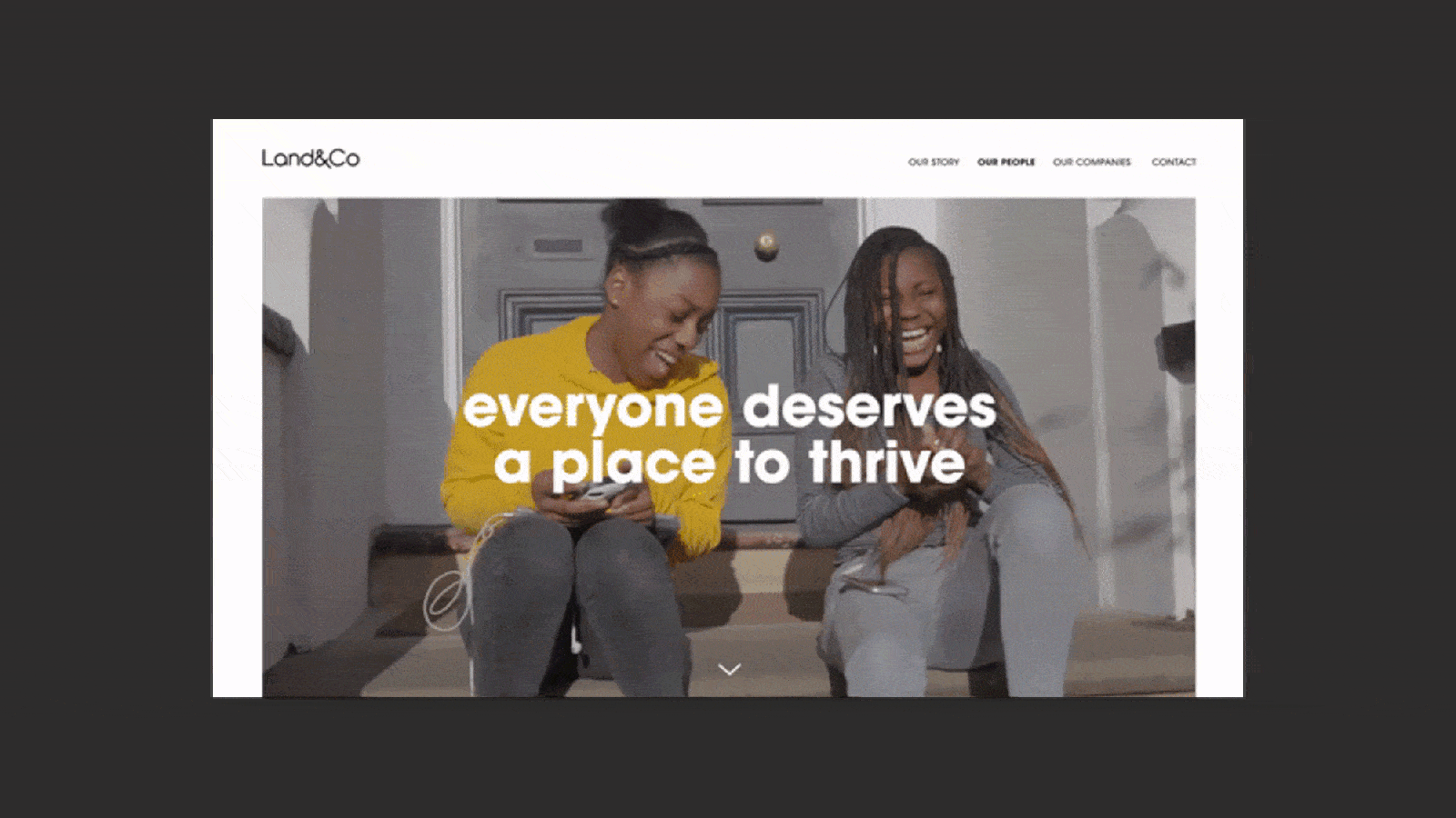
Overview
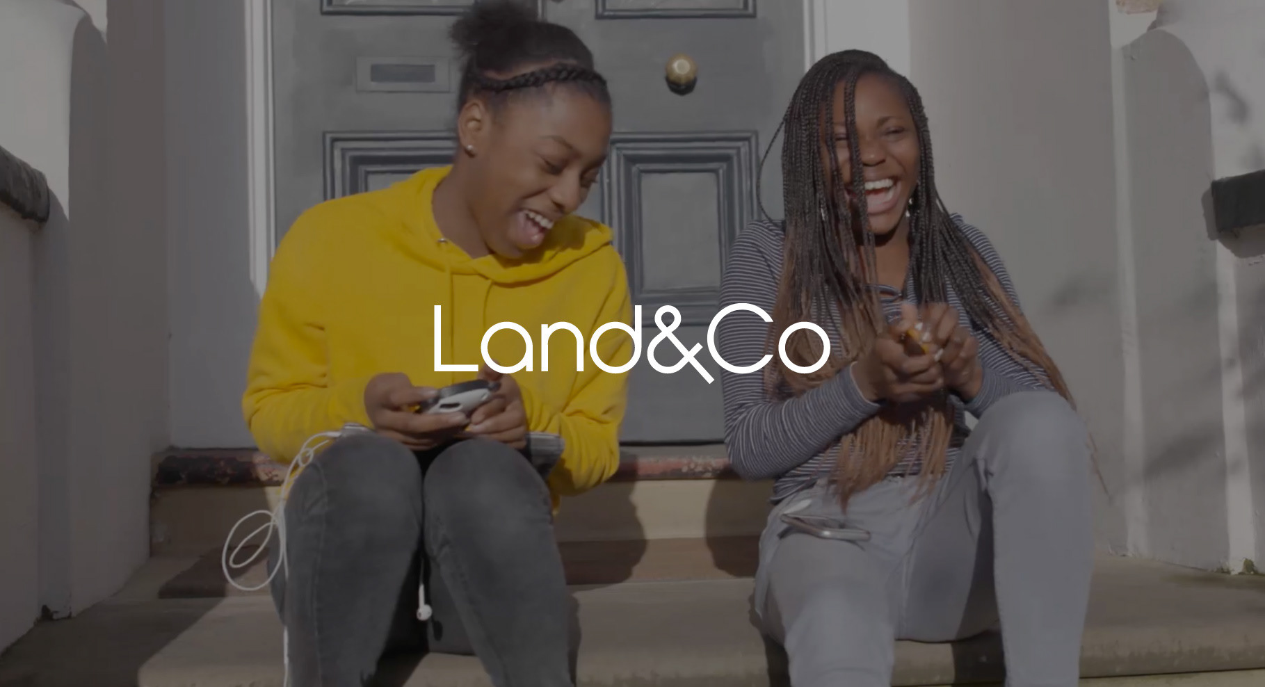
The brand needed to be professional to give their investors confidence, but not slick and soulless. The company is all about people, not just profits. I based it around the sense of community that Land&Co create for students, disabled people and the elderly.
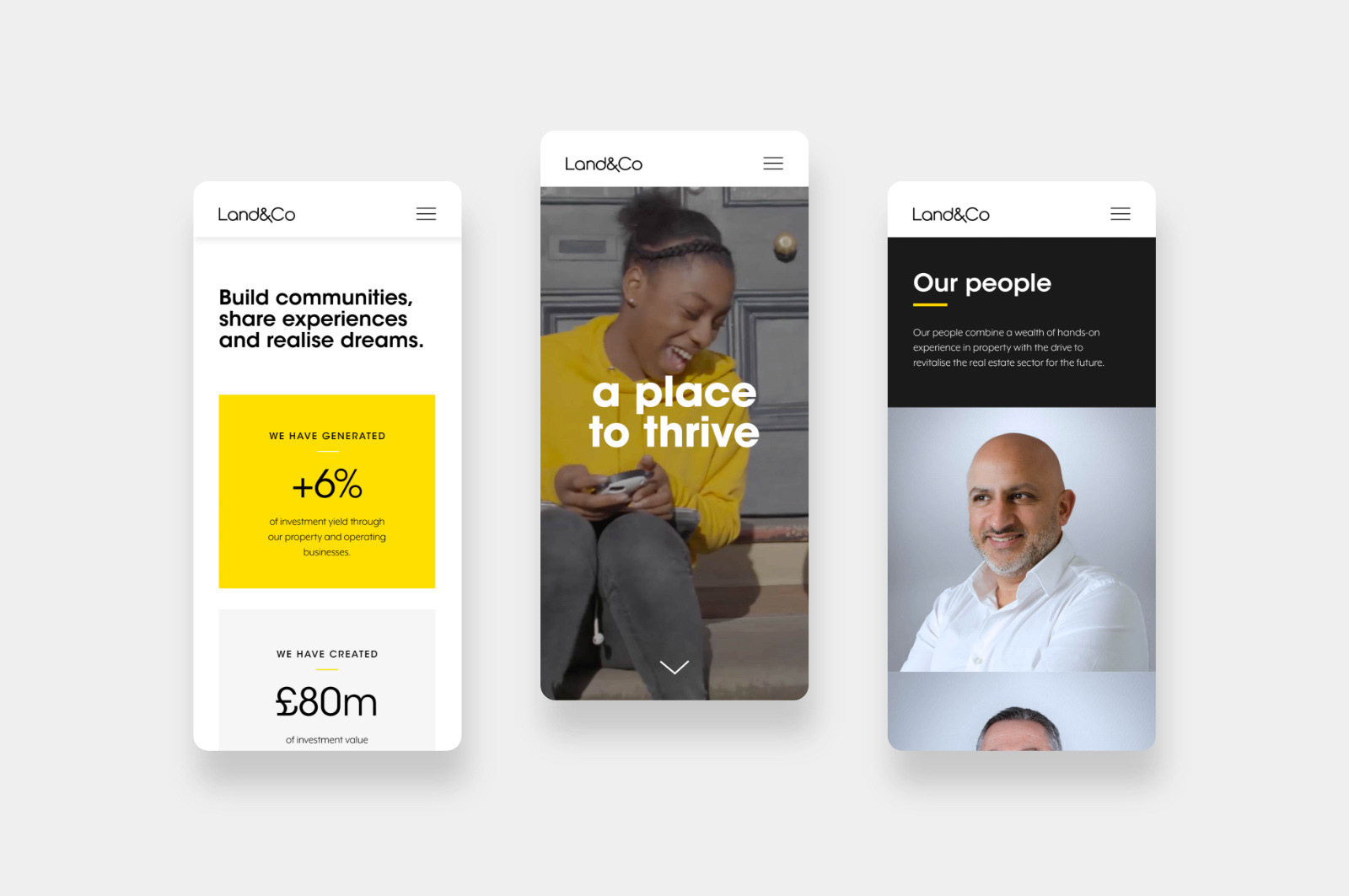
I worked closely with the company to outline the proposition and values. Then came the logotype, colour palette and stationery. Lastly came the website design which I worked closely with the developer to deliver on time.